RQM+
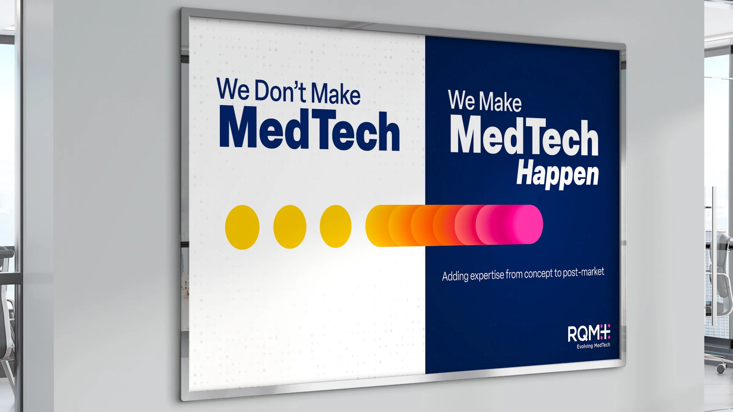
RQM+ is the leading MedTech CRO, providing expert regulatory and quality solutions that drive product success for medical devices, software as a medical device (SaaMD), diagnostics, and combination products. SCORR partnered with RQM+ to elevate their brand through a bold, strategic refresh — starting with a compelling Big Idea and extending across their website, collateral, and all aspects of their digital presence. From engaging social media to immersive trade show experiences and dynamic video content, SCORR helped ensure RQM+ stands out as the go-to partner for MedTech innovators.
- Big Idea
- Website
- Internal Swag
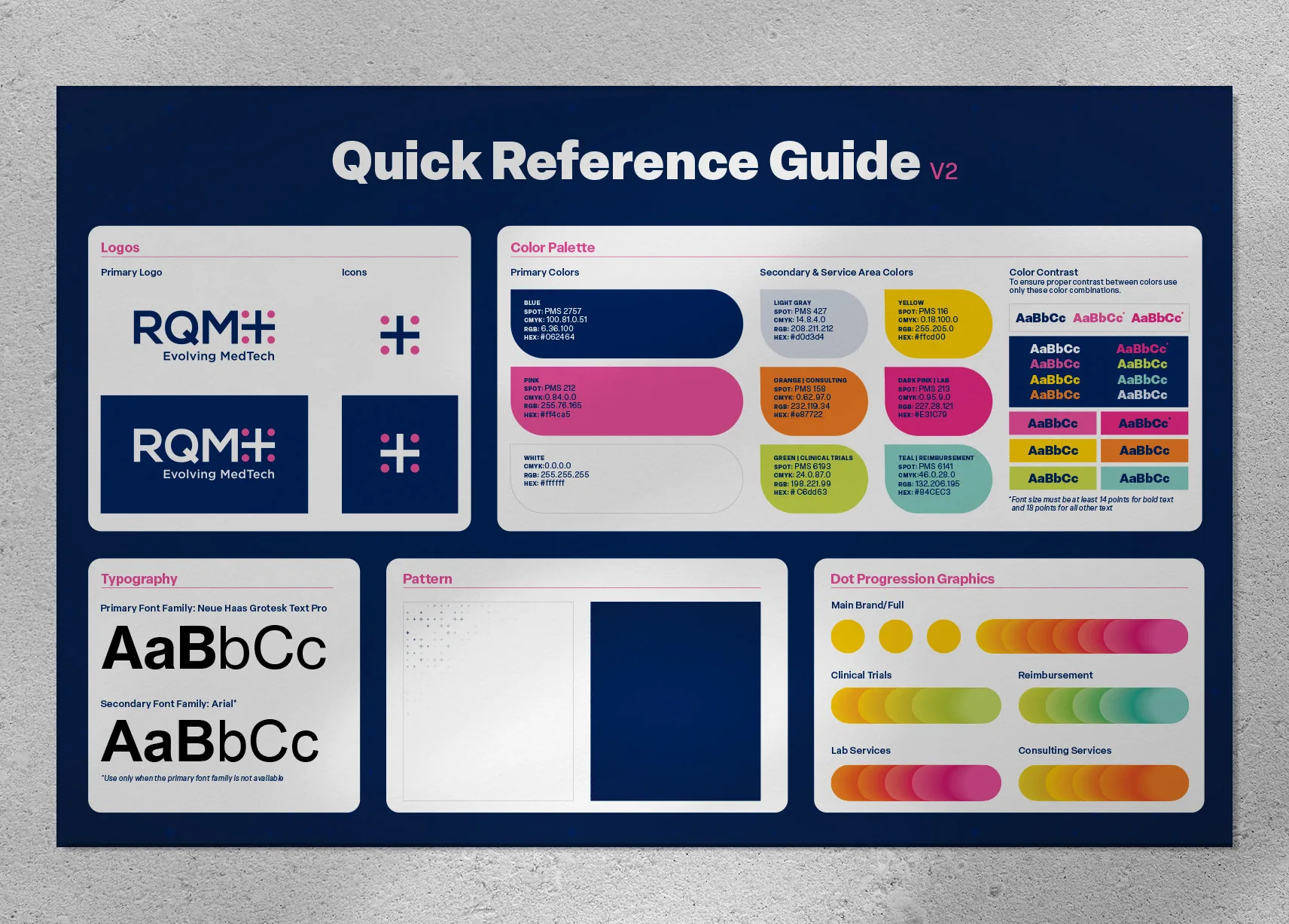
- Quick Reference Guide
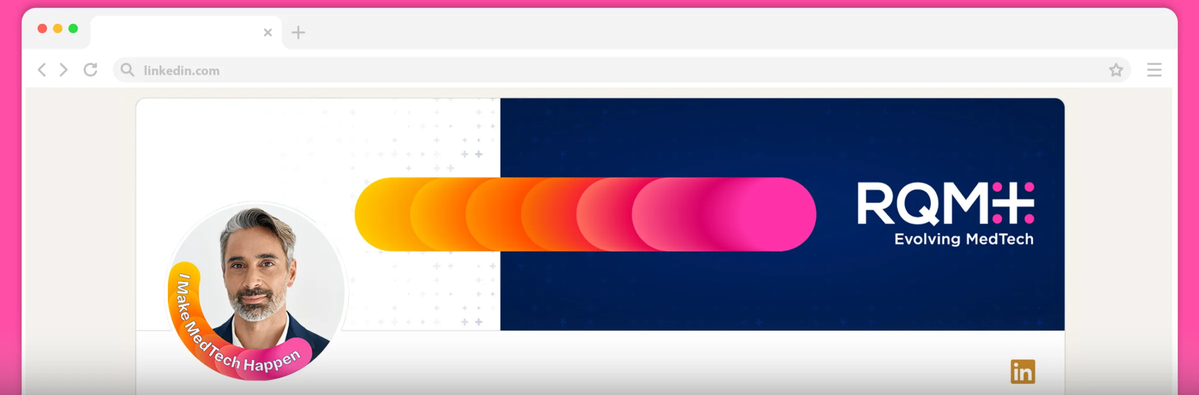
- Social Media
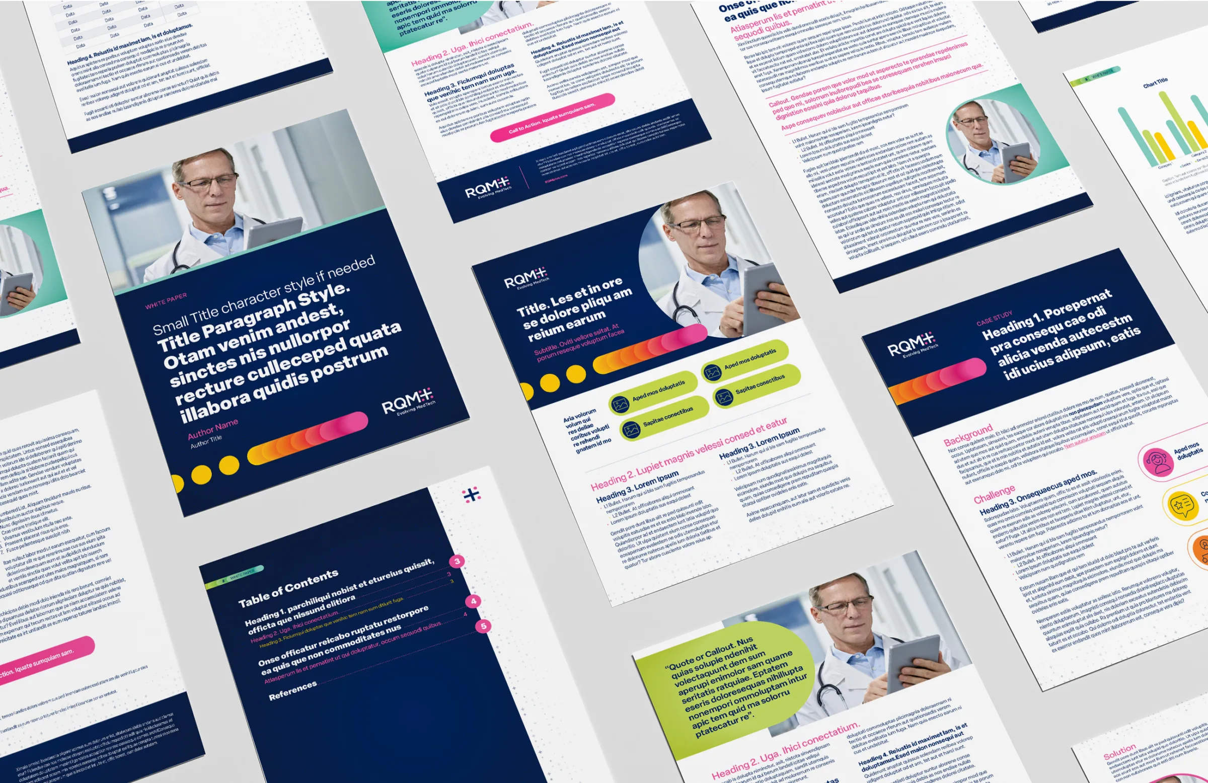
- Collateral
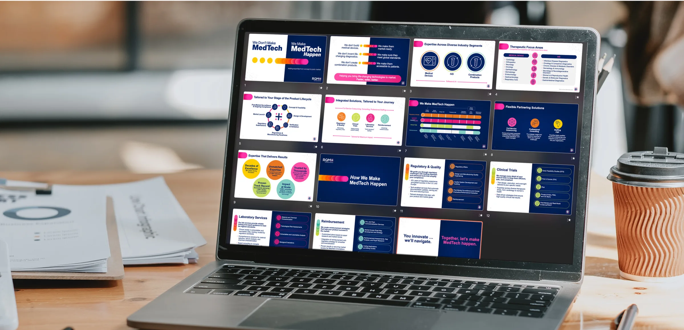
- Presentations

“Rebranding is never just about a new logo or tagline — it’s about telling a story that truly reflects who we are and where we’re going. SCORR Marketing understood that from day one. Their team became an extension of ours, bringing strategic insight, creativity, and a deep understanding of our industry to every step of the process. Their collaborative approach made what could have been a daunting process feel seamless and exciting. We’re incredibly proud of the results, and we couldn’t have asked for a better partner to help us bring our vision to life.”
Victoria Chester Rose, Vice-President of Marketing and Communications I RQM+
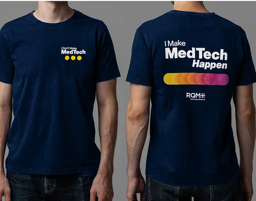
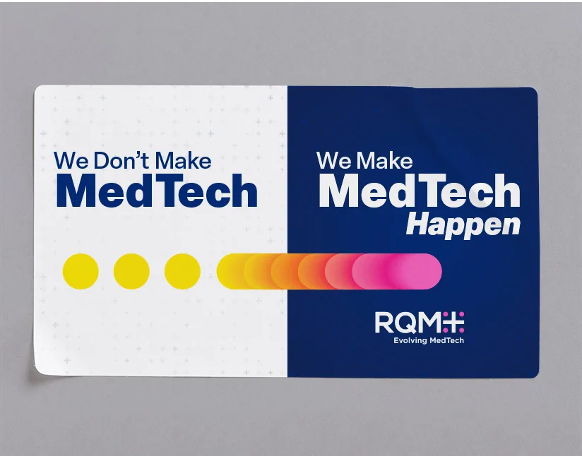
T-Shirts/Stickers (for internal reveal):
SCORR helped RQM+ bring their new brand to life internally with custom t-shirts and stickers. Featuring the Big Idea “We Don’t Make MedTech. We Make MedTech Happen,” these items fostered team pride and reinforced their essential role in driving innovation for their clients.